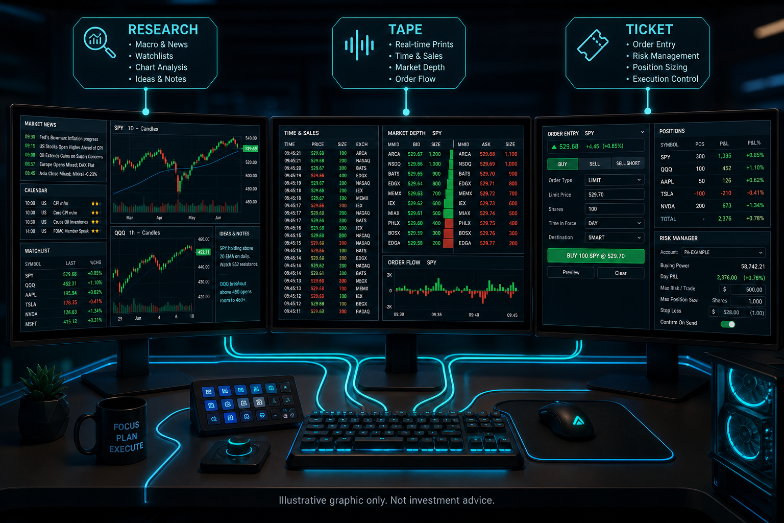
Extra monitors buy pixels, not discipline. Without deliberate layout, a multi-monitor rig becomes a wall of charts telling conflicting stories next to a live order ticket that is one stray click from a mistake. The screens themselves are neutral. What matters is whether each one has a defined job, and whether the ticket is protected from everything that is not its job.
That framing changes how you set up the desk. Layout stops being aesthetics and becomes part of your risk controls, the same way order types and size limits are. A layout that lets research noise sit beside the confirm button is a risk decision, whether or not it was made on purpose.
Assign roles, not charts
Give each display a single responsibility and let that assignment be a rule, not a mood. A practical three-screen baseline:
- Research and context: The slow-moving material, fundamentals, notes, and higher-timeframe charts, with flashing indicators kept to a minimum.
- Tape and structure: Depth, time and sales, volume, and the fast charts that describe what the market is doing right now.
- Execution and risk: The order ticket, open positions, working orders, and exposure, all visible without scrolling.
If you run a fourth screen, give it communications and the calendar, not one more chart. Chart creep is how layouts collapse: every added pane seems useful on its own, and together they make the desk harder to read.
Why does the ticket screen need isolation?
Because attention is the scarce input at send time. When you are confirming a symbol, a quantity, a limit price, and the paired exit levels, peripheral motion competes for the same working memory, and an ambiguous view of order state is how misclicks and wrong cancels happen. The moment a headline tempts you to “just tweak” a working order while half-reading it is exactly the context error role separation prevents.
Two habits make the isolation real. During order entry and immediately after the send, bring the execution view to full attention, even maximizing it briefly. It costs two seconds and can reduce the chance of leaving orphaned orders unnoticed. And mute what competes for language processing: notifications off during entry, and no spoken audio, because reading numbers precisely and listening to speech draw on the same bandwidth. If music helps, instrumental is the safer default.
What breaks when the layout travels?
A laptop in a hotel is not your desk, and pretending otherwise is where travel losses come from. Set the compromises by policy before the trip, not by mood during it. Smaller size caps on condensed layouts. Complex order structures you have not rehearsed on the laptop get retired until you are home. And check what the smaller screen hides: display scaling changes between machines can truncate or shrink quantity fields, and a decimal place you cannot see is a mistake waiting for the one moment you trust muscle memory.
The same logic applies to phones. Mobile is well suited to reducing risk and checking positions. Opening new, complex risk from a pocket-sized ticket is a different proposition, and deciding in advance which actions are desktop-only is cheaper than learning the distinction live.
Consistency beats novelty
Once a layout works, resist the weekly redesign. Muscle memory around where the ticket lives, where confirmations appear, and where risk is displayed pays off over quarters, and every rearrangement resets that clock. The test for any layout change is the same as for any process change: does it reduce errors, not does it look better.
How OHLCX fits the execution screen
OHLCX can serve as the execution-focused part of the desk. Asset Detail brings the chart context, Level 2, options data, and the order ticket together for the instrument you are working, so confirming an order does not mean hunting across windows. Floating panels and configurable views can help keep positions, watchlists, and risk context closer to the ticket, and real-time positions and P&L keep live account state visible instead of remembered. Keyboard shortcuts and persistent order defaults can reduce the rebuild errors that come from re-entering the same settings under time pressure, and exits like OCO, TSP, and TRIM can be selected before the order goes live, which keeps the bracket decision on the calm side of the send. None of this makes a trade good. It makes the execution screen legible, which is the layout’s actual job.
Layout is risk policy you can see
A multi-monitor setup earns its cost when every screen serves a contract with your attention, and the ticket holds the strictest contract of all. Assign the roles, isolate the send, standardize the travel compromises, and then leave the layout alone long enough for your hands to learn it. If your execution screen is currently a broker tab wedged between six charts, that is the place to start. Explore OHLCX to see what it looks like when the ticket, the exits, and the risk sit together in one deliberate place instead of scattered across the wall.
Leave a Reply